I create unique design & digital experiences for brands with power.
BRIEF: To create a new brand identity for A PHARMACEUTICAL company
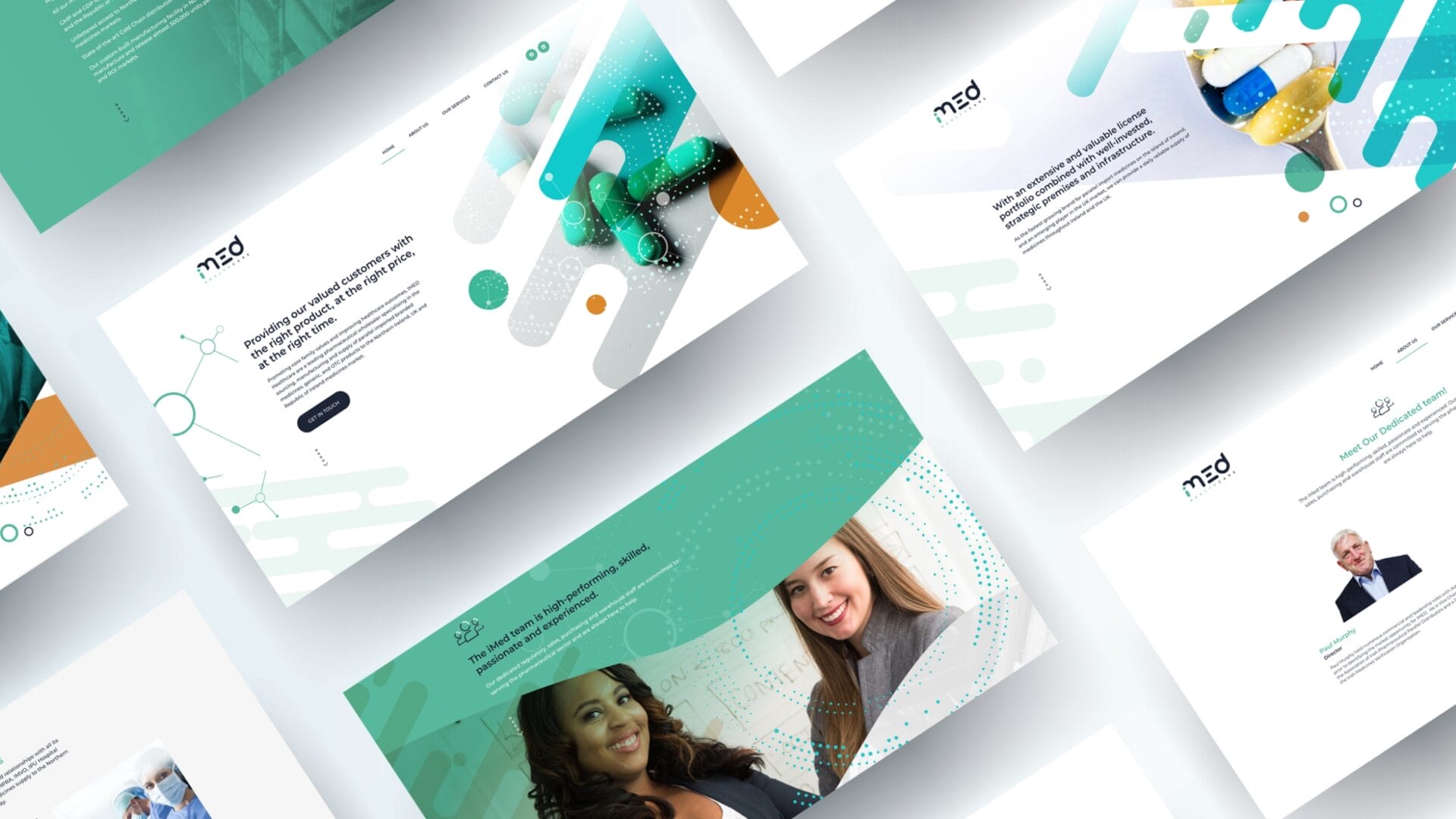
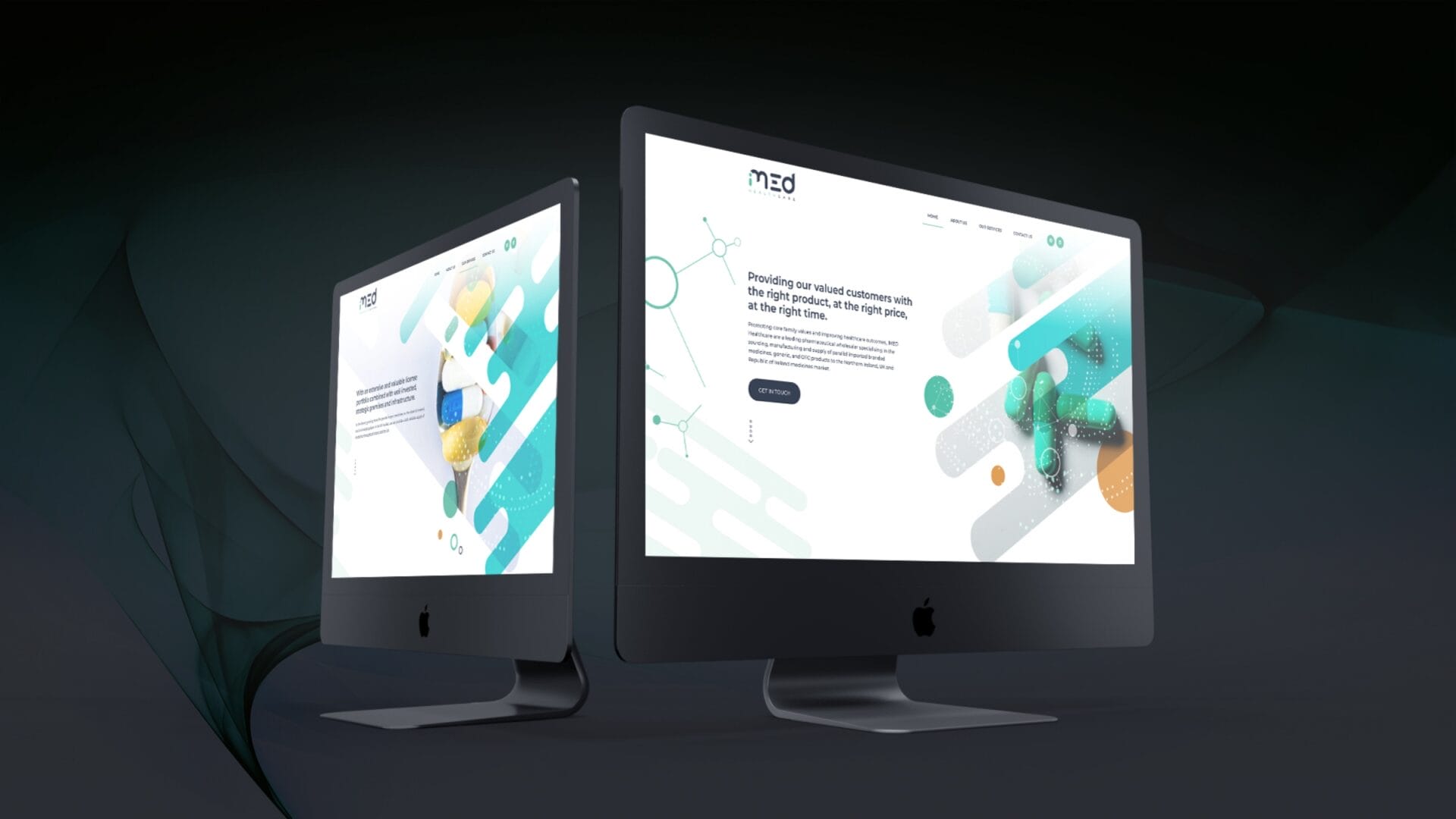
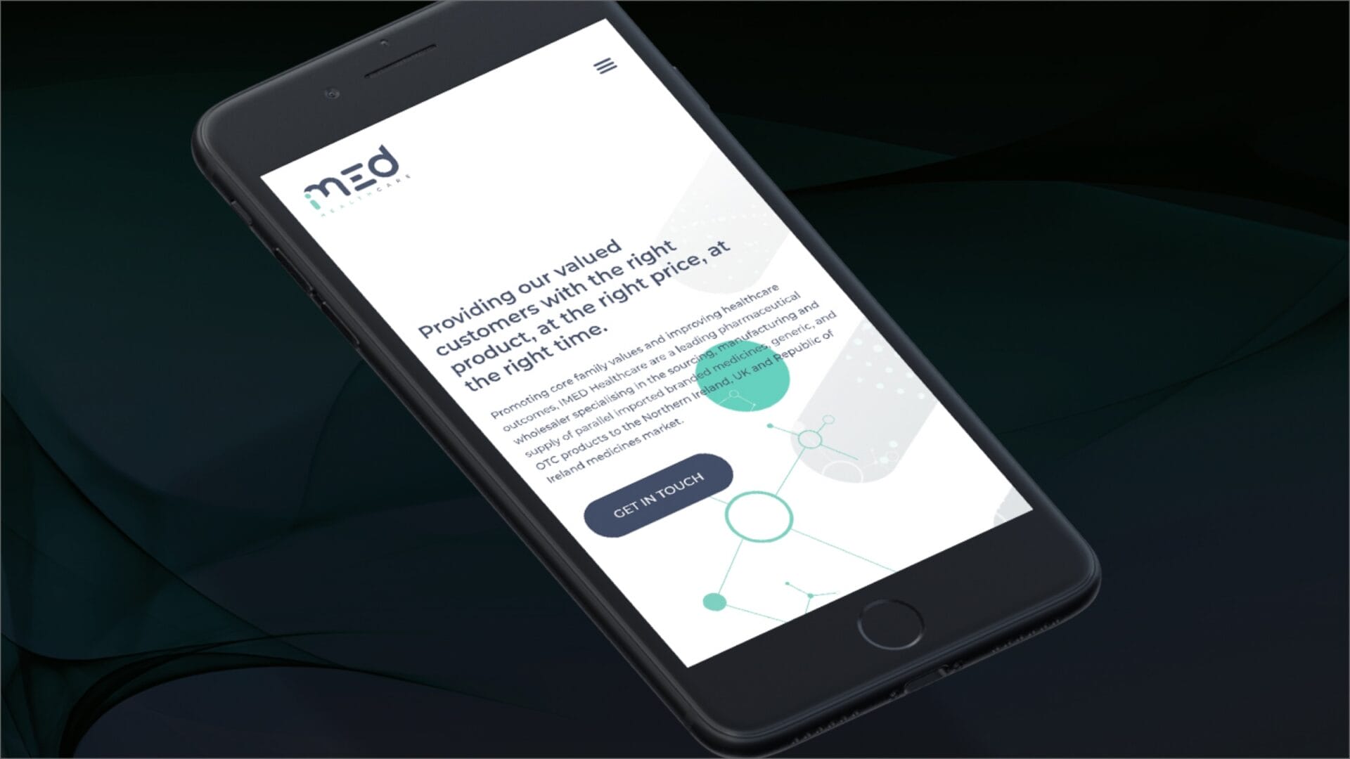
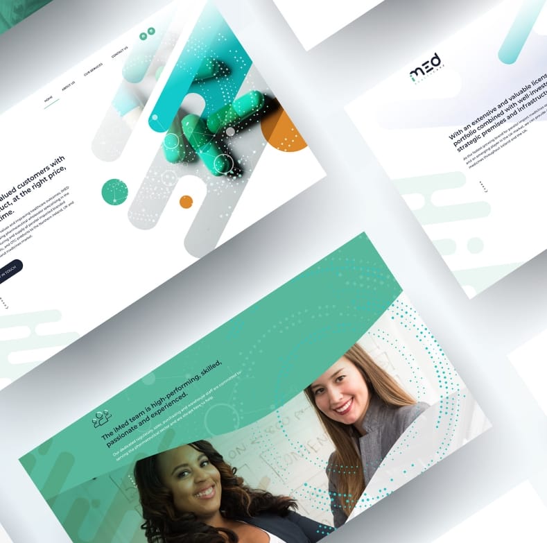
iMed Healthcare is a unique strategic platform providing unfettered access to Northern Ireland, UK and Republic of Ireland medicines markets.
At the forefront of pharmaceutical distribution, they integrate strong global partnerships, strategic placement, expertise and supply chain innovations.
Developing a unique identity that distinguishes it from others in its industry
A brand logo should be instantly recognisable: simple, unique, appropriate, and memorable. Most importantly, it should clearly convey the company’s messaging.
I wanted to convey symmetry, balance and impact with the brand mark. The mark’s aesthetic is evident throughout the full brand suite.
Your brand is who you are, what you stand for. Be your brand!
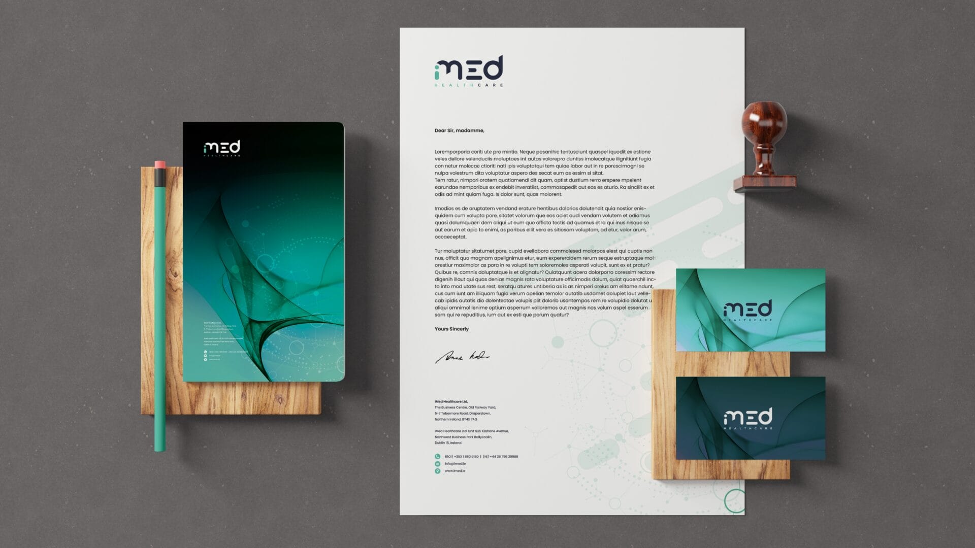
Brand stationery is more than a piece of paper. It’s the element that consolidates your visual identity and helps you stand out in front of your customers.
Utilising the new colour palette with clean typographic usage.
Development of a full identity suite across print and digital platfroms
The iMed palette is vibrant and varied and all colours used compliment each-other. The main underlying theme behind the palette is balance to convey innovation as well as security and trust in the brand and organisation.
Responsive contempory website solution to cater for the customers needs
These colours help build the visual impact of the iMed Healthcare brand across all forms of branded media, from print collateral to digital and social platforms.
Consistent reproduction is important when producing iMed Healthcare branded collateral.
My recent
selected work
MICHAEL JOYCE
Creative Design Specialist
I am a passionate and inventive creator of innovative marketing strategies and campaigns; accustomed to performing in deadline-driven, pressure environments with an emphasis on working within budget and to the highest design standards.


